Imagine a World Without Free Knowledge
Wherein I discuss Wikipedia’s anti-SOPA and PIPA blackout.
 Last week, I was heavily involved in one of the largest news stories of the week, in which we (the community of the English Wikipedia) chose to black out Wikipedia for a full day in protest of the Stop Online Piracy Act (SOPA) and the PROTECT IP Act (PIPA).
You might have seen it mentioned on various news sites.
I am very proud of our accomplishment. I want to write a bit how this went down, behind the scenes, and how I came up with the “black out” design, something I am extremely proud of.
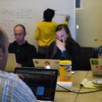
On the afternoon of Friday the 13th, I attended my first “SOPA War Room” meeting. At this point in time, it was clear that the community wanted to do something about SOPA and PIPA. We (the Foundation) felt that it was time to start the gears turning about enacting whatever the protest action was going to be.

I was brought into the discussion because the screens needed to be designed and implemented, and, well, my title is “Senior Designer.” I was tasked with coming up with two design variants and to publish them before midnight that evening (which gave me roughly three hours time, once I was able to work on them).
During this meeting, I walked everyone though the ramifications of the design so that we were all on the same page. I knew that since time was tight I was going to have to “get it in one” and we weren’t going to be able to do a lot of futzing with it.
I recommended that we go with something that was simple and had a “statesman” like feel to it rather than something over-the-top (which I referred to as the “dragonslayer” approach).
It was about an hour after this that I got nervous. “Jellyfish in my belly” nervous, because I realized that this was going to be an historic event, and really, how often does anyone design something specifically to be historic?
So. I armed myself with the following thoughts:
- The screen must be iconic. This image will be used in screen shots in the media and elsewhere.
- The screen must be simple. While the issues presented are complex, they must be boiled down to easy-to-understand concepts, with room for expansion.
- The screen must be symbolic. This is potentially a historical event.
And the following design considerations:
- The Wikipedia “puzzle globe” image is a “busy” icon, and not appropriate for the type of statement required.
- Simplicity over complexity.
- Seriousness over frivolity.
- The Wikipedia wordmark was deemed important to include.
My design philosophy is summed up as “More Kirk, less Spock.” I felt that, for this image, anything that could be deleted from the design should be.

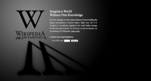
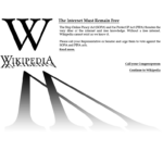
The first image I came up with was a “white” version. It was really just a really large “W” logo, in a dark grey, and a block of text on a translucent white box set to overlay it. It didn’t feel right, though, and in a fit of inspiration I added the shadow to it.

I then sent the images around to the team for comments. We played around with the sample language a bit and I published them to the discussion on the English Wikipedia around 11:30 pm, about two and a half hours after I started.
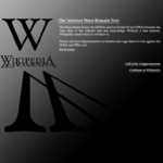
We figured that the community would come to a vague consensus as to which direction they wanted to go within about twelve hours: do we want to go with a “light” theme or a “dark” theme was the real question.
The next morning I woke up to see that the “dark” image was leading in the polls by a factor of around 50 to 1. So, that answered that question pretty clearly, and we (Ryan Kaldari and I) began the technical implementation.
The black out screen was actually implemented through the technology we use for our fundraising banners (it’s called “CentralNotice”). We chose this method because at the time we were still assuming that it was going to be an interstitial image (so we had to load the “real” Wikipedia behind the scenes) and that it was going to be targeted to the USA (the banner system has some sophisticated Geolocation technology).
I did most of the initial html and css coding on a static page (Neil Kandalgaonkar would later do the implementation inside of CentralNotice entirely in Javascript) while Ryan worked on creating an extension to handle congressional representative lookups. We had a passable prototype by the end of day, Sunday.
I made some tweaks to the image design along the way – tweaks that I thought were minor at the time but ended up having a massive impact to the overall mood. I raised the W logo from its shadow, so that it floated, and I changed the gradient to be radial rather than linear.
Monday was a work holiday, but the Anti-SOPA team came into the office anyway. This was when the bulk of the congressional lookup feature was coded (though the superheroes I work with were coding it right up to the launch on Tuesday evening).
At four o’clock in the afternoon on Monday the consensus discussion regarding the protest was closed and we were given our marching orders: a global, “hard” blackout, 24 hours, beginning at midnight EST on Wednesday the 18th (which meant we had to launch at 9 PM local on Tuesday evening).
Monday evening’s war room time was spent on messaging: Sue Gardner wrote a blog post explaining what we were going to do and why. It was published and linked from a banner on Wikipedia and. . . instantly crashed the blog server.
Ryan Lane spent an hour heroically battling the performance issues on that server, upgrading it, adding caches, and generally hyperdriving its performance. This was a weird thing: no blog post had ever gotten more than a few hundred comments before but this one picked up a couple thousand within an hour. It took four of us operating at once to moderate the comments they were coming in so fast (as of this writing, there are almost 13,000 comments on that post).
The decision for the black out to be global and “hard” were problems for us. At the time that the decision was handed down, we had been committed to our technology choices (the train had actually left the station on Friday, to be honest). Blacking out the mobile gateway was a non-starter: that technology doesn’t do CentralNotice at all and the development time required was deemed too much.
We also made a call that there should be ways for people to get at the data if they absolutely needed to, which is why we designed in some ways to get around the black out screen (disabling Javascript, pressed ESC before it loaded, and appending ?banner=none were all ways to do this).
I’ve been asked a lot why we didn’t just point a redirect to a single “black out” screen and the answer to that is, frankly, it would have annihilated our search rankings. We felt that doing so would actually be a disservice to The Mission. Google suggested that most sites just return “503” error codes to avoid this, but Wikipedia isn’t “most sites”: we are indexed differently (Google polls the recent changes feed). We were specifically told not to do the “503” trick.
Tuesday was a blur of meetings. Meetings about messaging. Meetings about press coverage. We wrote and rewrote the text of the landing page about fifty times. Everyone who could program was working on getting the congressional lookup system working. We ran into problem after problem and worked through them. Text was being edited all the way up to the launch moment.
I was plugged into the projector. At nine pm I hit “refresh”, and this is what happened.
I work with some superheroes.

In the end, we managed to change minds. We flooded the internet with our message and people listened. We melted the phone lines on Capitol Hill. We struck a blow for the free and open internet.
And that’s something, I think.
The entire event was exhausting, exhilarating, and elating. I felt closer to The Mission in those hours than I ever have.
I had lunch today with a friend of mine who used to work for the Foundation and she told me that she’d never been prouder of us and what we do than that moment. It was a good thing to hear, and a good thing to feel.
I absolutely love this job. I want to say thank you to everyone on the planet for giving me the opportunity to do the Good Work. I am filled with gratitude, knowing that this work makes a difference.
Comments on Imagine a World Without Free Knowledge
The design was iconic and worked really well for this purpose. I think it was a major contributing factor to the success of the blackout — media loved to pick it up because it was so stark and unusual, without being cluttered or silly.
For Honor, and the Emperor!
Good show, sir.